
This page is a living reference for how ParmaViolet renders Ghost’s core editor cards and typography. Use it on the demo site to verify card_assets, content width, and dark-mode contrast.
Typography
Regular paragraph text sits in the main content column. Bold, italic, links, inline code, and strikethrough should all feel intentional.
- Unordered list item one
- Unordered list item two with a link
- Unordered list item three
- Ordered step one
- Ordered step two
- Ordered step three
// Code block sample
const theme = "parma-violet";
console.log(`Hello from ${theme}`);
Headings
Heading 1
Heading 2
Heading 3
Heading 4
Heading 5
Heading 6
Blockquotes
Standard blockquote — use this for pull quotes and citations that should feel editorial.
Alternative blockquote style — cycled in the Ghost editor for a lighter, centered emphasis.
Divider
Content above the divider.
Content below the divider.
Image cards
Normal width

Wide

Full width

Gallery card


Bookmark card

Button card
Callout card
Toggle card
What is ParmaViolet?
Do card assets load automatically?
Product card
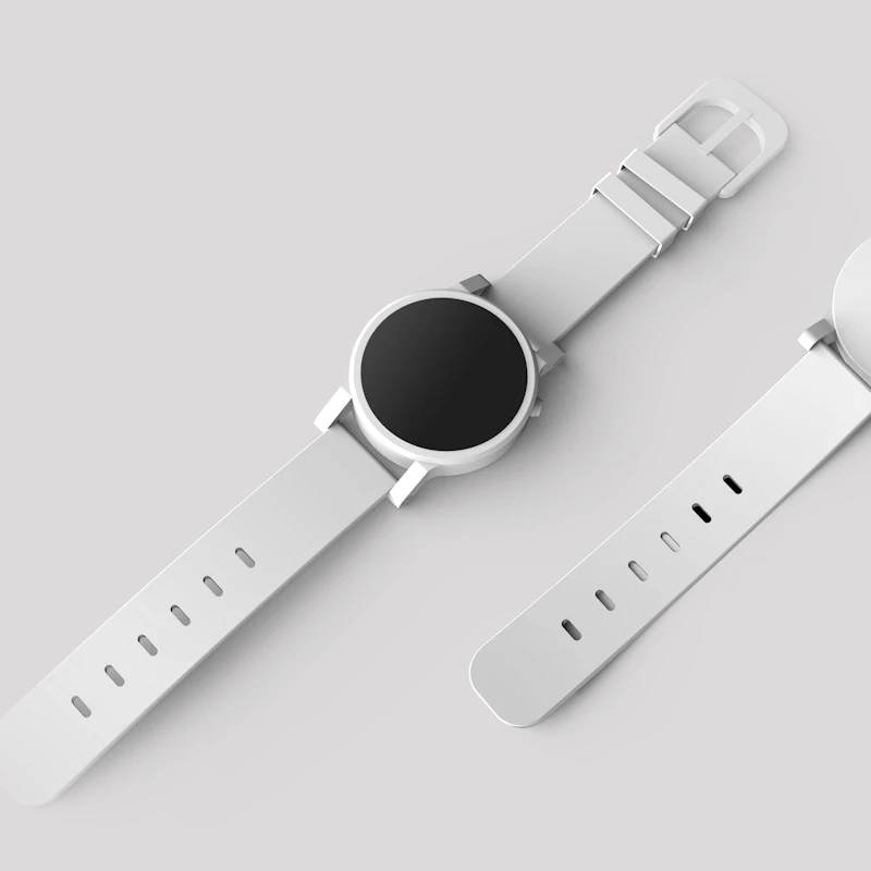
ParmaViolet Theme
A calm, modern Ghost theme with flexible heroes, memberships, and editorial post layouts.
File card
Audio card

Audio playback relies on Ghost’s injected cards.min.js. Replace the sample MP3 with your own media on a production demo.
Video card
Native video card chrome is enhanced by Ghost card assets. You can also paste a YouTube URL for an embed card.
Embed card
Header card
Dark header
Small size for quieter transitions
Signup card

HTML card
HTML cards can hold widgets and custom markup. Example:
Custom HTML block
Useful for forms, calculators, and third-party embeds that aren’t auto-detected.
Tables
| Card | Class | Notes |
|---|---|---|
| Image | .kg-image-card | normal / wide / full |
| Gallery | .kg-gallery-card | up to 9 images |
| Bookmark | .kg-bookmark-card | rich link preview |
| Toggle | .kg-toggle-card | needs card JS |
| Signup | .kg-signup-card | members form |
End of style guide. Return to the homepage or browse the field guide.